Great tutorial on Linkedin header images from Viveka von Rosen at SocialMediaExaminer.com. It just happens to showcase my Linkedin header image.
By Viveka von Rosen
Published August 6, 2014
Have you noticed the new images at the top of LinkedIn profiles?
Do you want to grab people’s attention and really show them who you are?LinkedIn recently released header images, also called hero images, to its premium account holders and is slowly rolling them out to everyone.In this article you’ll discover how to choose what to share in your header image and how others are using theirs.Know Your Header Image Basics
Learn to use the LinkedIn hero image.
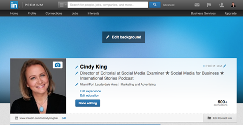
LinkedIn’s new header image allows you to increase your branding and visibility, showcase who you are and attract new followers and connections. They are a lot like the banners you have on Twitter, YouTube, Google+ and Facebook.If you are not sure if you have the hero image feature yet, take a look at your profile. If you have a big blue rectangle and the Edit Background button above your normal profile, you’re good to go.
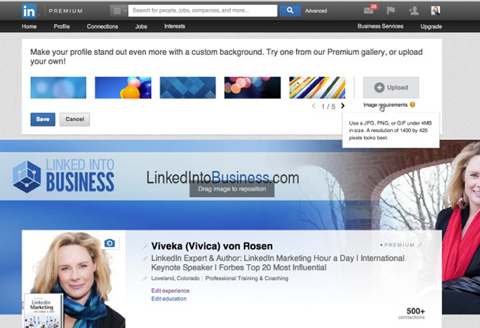
Don’t have hero images yet? Be patient! LinkedIn is rolling out this feature slowly.To get something up immediately, LinkedIn offers 25 different stock images you can use, but you will probably want to create a custom image for your page. That way you can share more about yourself and your business (I’ll talk about that in a minute).
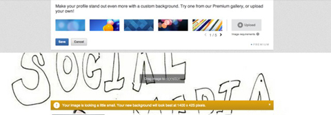
Even if you don’t have a design created yet, add one of these stock images.I had my graphics guy at Fiverr (no, I’m not giving you his name) who does all of my LinkedIn hero images (company, showcase and group pages) do my new profile hero image since I am graphically impaired.But if you have Photoshop or even PowerPoint skills, you can probably put an image together pretty quickly.The hero image is 1400 x 425 pixels. When you create your custom image (or have your graphics guy do it), make sure the image has a very high resolution and is less than 4 MB.If the image isn’t high resolution, it will look blurry; if the file size is over 4 MB, LinkedIn won’t let you upload it.
Too small and your image is blurry, too big and it won’t fit!I have tested several images and let it be known that less is in fact more. If your image is too busy at the top and sides, your attraction turns into a distraction.Choose Your Header Image Content
As my friend Donna Svei points out, when creating your profile you want to ask yourself, “How can I use this feature to help people understand what I do and how well I do it?” You can apply that same question to your hero image.If you want to use your hero image to drive more connections and followers,include a “Connect with me!” call to action and provide your contact information. And don’t be shy about showcasing your own position and expertise.At its most basic, your hero image should include your logo and contact information, but the banners I’ve seen that I like the most are more eye-catching—even shocking.While my own image is less arresting, it is in alignment with all of my personal branding.
Help people recognize and connect with you by keeping branding consistent.My banner includes both the business focus (logo and contact info) with a more casual image of me, so people get the feeling they know me. Because as my favorite Bob Burg quote goes, “All things being equal, people do business with people they know, like and trust.”Find Your Inspiration From Others
Here are a few more examples of how others are taking advantage of LinkedIn’s newvisual marketing opportunity and using it to promote themselves, their businesses and more.Show Your PersonalityBryan Seely capitalizes on his name (Seely) sounding like “silly” and infuses his hero image with his sense of humor, while still hinting at his business. (He’s an ethical hacker, writer and engineer.)
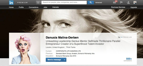
The new hero image feature allows you to show more of your personality.Bryan’s informal take on his branding draws people in, while his As Seen On section reinforces his established reputation.Focus on DesignDanusia Malina-Derben juxtaposes her eye-catching (really, it’s all about her eyes) hero image with her whimsical profile photo.
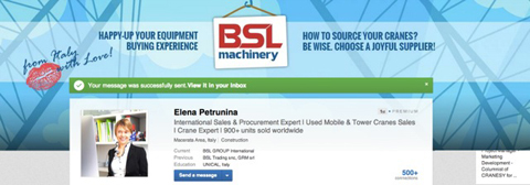
Add an image to capture the attention of your audience on LinkedIn.Design elements that complement each other (e.g., different colors, image sizes, etc.) make your hero image much more interesting.Share Your MissionElena Petrunina owns a thriving company in Italy that sells cranes (yes—as in construction cranes). Her business recently changed its branding, so she keeps the new imagery and her mission statement front and center in her LinkedIn banner.
Showcase your mission statement.Visually reinforcing commitment to mission and vision strengthens your positioning with current and prospective customers.Promote Products and EventsBecause you can change your hero image as often as you want, you can use it for a variety of promotions. Craig Fisher uses his hero image to highlight live events.
Craig Fisher uses his hero image to promote his upcoming event.Creating a custom header with dates, images and
information helps to showcase new books, ebooks and product launches.Provide ValueYou can add value to your customers and leads—and keep them coming back—by changing your banner frequently and offering a quote or tip of the week.
Use your banner to bring people back to your profile.Over to YouBack when I started using LinkedIn in 2005, it was a purely text-based social site—not a picture to be seen except for the LinkedIn logo and your photo. Over the years that has changed, and you’ve likely evolved with those changes.It’s time to do that again. To take full advantage of LinkedIn’s new hero image, get your visual storytelling strategy in place and highlight the best of your business.What do you think? Do you already have a LinkedIn hero image? Do you have any other great examples of hero images on LinkedIn profiles? Please share them in the comment section below.


